 I love the coordinating styles that some with some digital kits, such as Flerg's glitter styles so today I'm going fill you in on how you can use them to add a special something to your next layout.
Some of you may not have used styles before if that's you - great! Hopefully, you'll be able to follow this tutorial. Remember if you have any questions just ask away in the comments.
Firstly, unzip and install the files. If you are wondering how to do it, I've found instructions for both Photoshop and Photoshop Elements.
Photoshop
Check out Flerg's instructions here
Photoshop Elements
Check out the Hummie's World tutorial - styles are number 5 on the page - this one has a video and PDF (8 pages with lots of screenshots!)
Now it's time to play!
Enhance your Elements
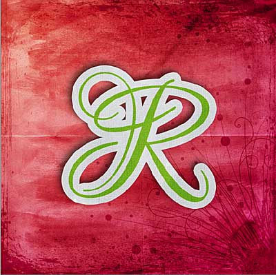
First I tried making the whole letter plastic coated. Ctrl+J to duplicate the layer and apply your desired style. The clear plastic shows through to the letter underneath.
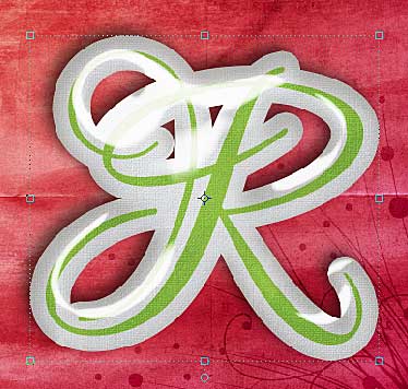
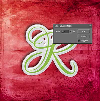
Playing around with the Layer - Layer Style - Scale Effects menu I decided 20% scale worked for me.
But what about just making the green part plastic - like I stamped it with embossing powder?
I just used my magic wand tool to select the green area:
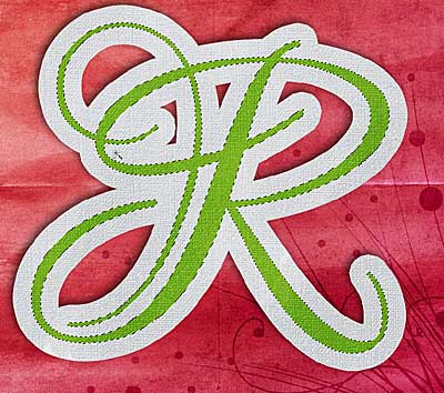
Duplicated the selection (Ctrl+J) and applied the green solid plastic at 20%:
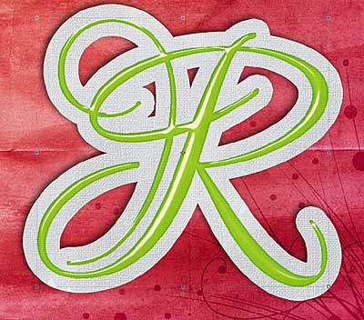
and how about 20% glitter?
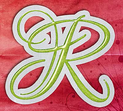
Element Makovers
Want to use that perfect element but the colour is wrong? Styles are great for that!
Here's a quick and easy makeover for an M from Impressions of Comfort - using the plastic glitter style 1 at 100% scale... You could also just apply the style to a text layer!
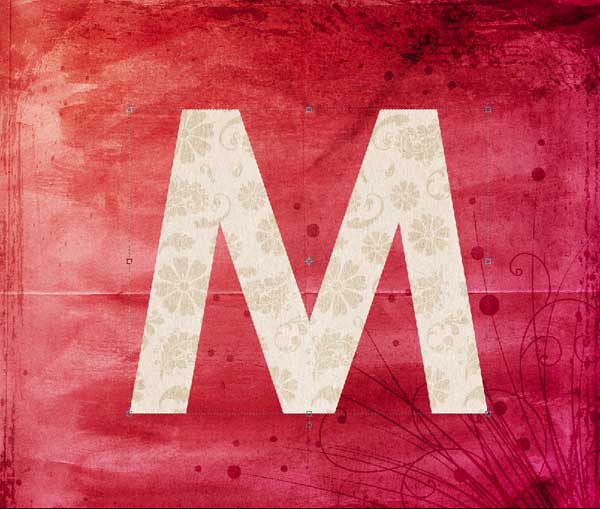
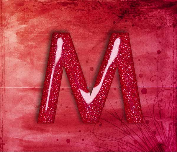
I've taken a brad from as an example here and just used my magic wand tool with a tolerance of about 30 to select the coloured area, and then held down shift and added to the selection to grab the highlight and shadowing as well.
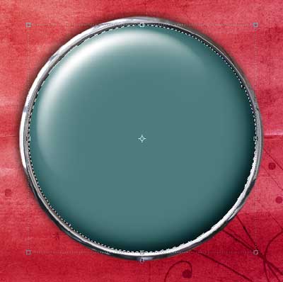
Then just Ctrl+J to make a new layer from the selection and apply the style - in my case I used the white plastic at 100% scale.
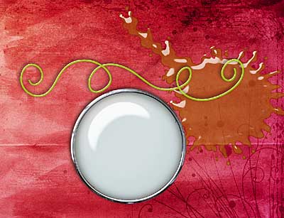
How about the plastic cord? For this I had to change the scale to 5%. For the splat I used 30% scale with one of the clear plastic styles - awesome!
For this girls element I wanted to change the colour of the stars to match my page. So it went from:
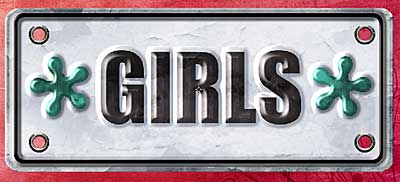
To this:
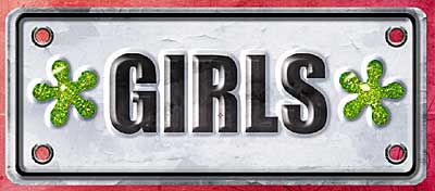
With a bit more magic wand selecting.
Then I decided to add some plastic to the Girls lettering - this took a little bit of fiddling as the letters have hightlights, but it was still a quick job.
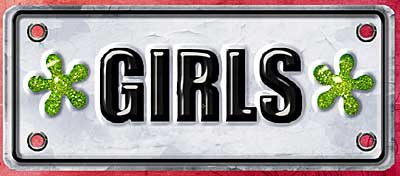
So now I've given you a few pointers you can see how much fun these styles are! 🙂
Melissa
Credits: All items created by mgl Scraps, but no longer sold.
I am an Amazon affiliate so may receive a commission if you make a purchase.

Leave a Reply