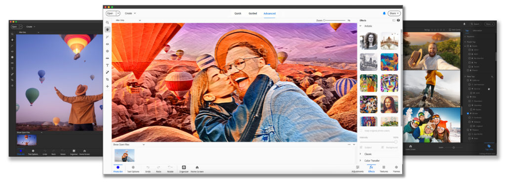
The first change you'll notice is the all-new interface. Adobe has upgraded Elements with modern fonts, icons, buttons, and colors that are easier on the eye.

The tool icons in Elements now match up with the tools in Photoshop or Premiere for more consistency across the programs. You can choose from light and dark mode options, so you can go over to the dark side or stay with the light and bright interface you are used to. Those changes apply to the Photo Editor, Organizer and Video Editor seperately, which is a nice touch.
Are you going to join the dark side? Let me know in the comments if you are team light ☀️ or team dark 🌑
You'll see another couple of other changes in the interface. Expert Mode is now called Advanced Mode. Plus the confirmation icons for edits have changed. No more green ticks and red cancel signs! Now the apply and cancel buttons are bright blue check mark and cross respectively. The type tool now has filler text (Lorem Ispum) so you'll never 'lose' your type in your PSD again!
Do you like the refreshed look and feel with Light and Dark Modes?
Happy scrapping

I am an Amazon affiliate so may receive a commission if you make a purchase.
Leave a Reply