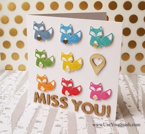
Today, Margareta Carlson from Scrappypedia is sharing how we can make the most of the fun rainbow trend in our layouts.
Rainbow colored projects have been such a strong trend this year. But how easy is it to apply the look on your own projects? Where lies the fine line between color catastrohpy and irresistible eye candy?
I have to admit that I was reluctant to apply the rainbow color combo to one of my Scrap Stash kits. Every month I put together a kit from my stash in some interesting an on trend color combo, mixing newer items with really old products to create cards and scrapbook pages. I call it the Scrap Stash Kit Club, and the members/e-mail subscribers get to make their own kits and get inspiration to use their scrapbooking supplies. (Sign up for the e-mails here, if you would like to play along). For the March kit, I finally gave in to my desires and pulled together a rainbow kit, Jackpot.
It was so incredibly inspiring - and freeing! - to release that lust for color and use anything in my stash that caught my eye. I don't think I have ever scrapped my monthly projects as quickly! And I have never before gotten so much positive feedback on my scrapbook pages. So, yes, I guess we all love the rainbow.
Here are some tips and tricks on how to rock the rainbow on your own projects. They are the same whether you are doing digital, hybrid or paper scrapbooking.
1. Start with a neutral background
Rainbow colors on brightly colored paper is not a good idea. The eye has to find somewhere to rest between all those bright colors. Neutrals works as a great contrast to strong multicolors.
2. Hold back on the patterns
Don't mix too many different patterns at once, such as big florals, swirls, triangles and horses, all on the same page. It will just look messy.
3. Follow the map
Use the colors in the same order as they come in the rainbow. If you place the colors the wrong order, the rainbow effect will disappear. You can pick any color in the rainbow as a starting point. You don't always need to start with red.
4. Use black and white or neutral photos
If you use a lot of colors on a page together with a very colorful photo, chances are that the photo will be lost in the layout. But if you contrast your multicolors with a black and white photo, the photo will stand out from all the colors surrounding it.
5. Use repetition
Multicolored projects work very well with repetition of a shape or figure in all the different colors. It's like the repetition itself has a "calming" visual effect on the multitude of bright colors.

You are welcome to take away more in depth advice and several example projects in the article 'Rock the Rainbow' on my blog. You will also find the link to a FREE downloadable Rainbow Bucket List card on that page that you can use on your digi projects or print for your paper scrapbook! Go and grab it now!
Are you feeling this rainbow trend? Do you love it or hate it? I would love to hear your thoughts! 🙂
 Margareta Carlsson is the leading trend reporter in scrapbooking, with her blog www.paperpilekitten.com. She is also the founder of several web sites helping to organize and use your scrap supplies: www.UseYourStash.com, www.OrganizeYourStash.com and the scrapbooking product database www.Scrappypedia.com including the free iPhone app Scrap Stash for indexing supplies.
I am an Amazon affiliate so may receive a commission if you make a purchase.
Loved this article and the helpful tips and tricks! I will keep this for future reference! Thanks for posting!
Great tips Margareta! Gorgeous projects!!