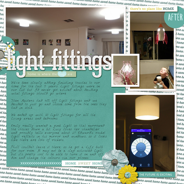
Each week I share a scrapbook layout to give you a little sneak peek into what I’m scrapping, and inspire you to play with pretty pixels too. Today I’m sharing a page all about adding light fittings to our home.
Layout: Light Fittings

Create the Look
For a story-heavy page, I find it helpful to begin with the journalling and just type it all out.
I love using a handwriting font for my journalling to add a personal touch.
Select a few photos and resized them all to fit in a column. Add a white border - as I do on most pages to help the photos stand out! Fill in any white space with embellishments.
Use a plain cardstock to make the journalling readable.
Use a contrasting alpha for the title.
You can add interest to the title with a ribbon and strip of patterned paper to finish the page.
Journaling
We've been slowly adding finishing touches to our home for the last 5 years. Light fittings were on our list but I'd never got excited about deciding what fittings should go where.
Then Masters had 40% off light fittings and we decided to just go and choose some from the ones they had in stock.
We ended up with 10 light fittings for all the living areas and bedrooms.
Emily really wanted a pink light so that narrowed the choices down a bit. Lucy loves her chandelier and proudly tells everyone about it! Edward's rocket light reflects in his mirror and windows, so it looks like there are lots of rockets.
Phill couldn't leave it there, so he got a Lifx bulb for our room. It may not be a clap activated light, but it's pretty cool to be able to turn it on and off, dim and change the colours via our phones.
Credits
- Kit Meg Designs Travelling Home
Care to Share?
I’d love to see what you are working on this week. Do you have a layout or two to share? You can add a picture to the comments below.
Happy Scrapping!

I am an Amazon affiliate so may receive a commission if you make a purchase.
Leave a Reply