Each week I share a scrapbook layout to give you a little sneak peek into what I’m scrapping, and inspire you to play with pretty pixels too.
Today I’m sharing a page from my childhood album.
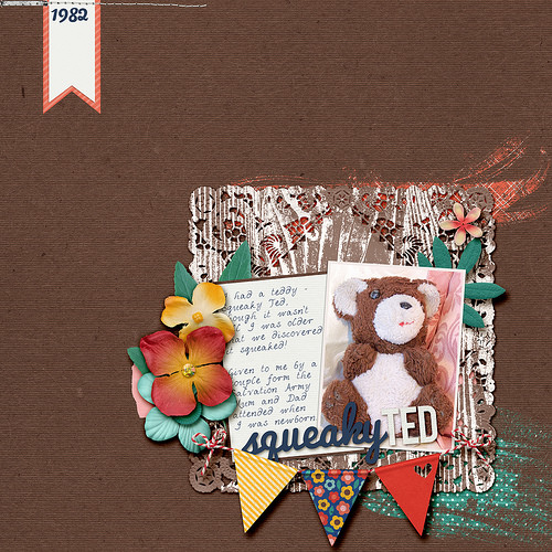
Layout: Squeaky Ted

How I did it
For today's page I took the teddy's fur and red mouth as my color inspiration. Here's how to get the look
- Choose a dominant color from your photo as the background paper
- Use a 3x4 photo and add an inner stroke.
- Use a doily to start building the main cluster in the bottom right
- Add journalling in a handwriting font onto a journaling card
- Hang a banner to connect the photo and journaling
- Embellish around the outside of the photo/journalling block.
- Balance the heavy cluster with a little banner for the date and some stitching to hold it down.
- Created the title from fonts.
- Nestle the title in the space below the journalling
- Add some mixed media look pieces to finish the page
Journaling
I had a teddy - Squeaky Ted, though it wasn't till I was older that we discovered it squeaked!
Given to me by a couple form the Salvation Army Mum and Dad attended when I was newborn.
Credits
Create Something Beautiful from Sweet Shoppe Designs, WWC__JoieDeVivre__Template
 Make it Monday
Finally! Why to start pocket page scrapbooking and how to make it easy! Read more here
Care to Share?
I’d love to see what you are working on this week. Do you have a layout or two to share? You can add a picture to the comments below.
Happy Scrapping!

I am an Amazon affiliate so may receive a commission if you make a purchase.
Cute page! I didnt beleive it was digital when I first saq it!
Thanks Ashley Would you believe I just realised this is the 2nd layout I’ve done about that Teddy! I must really love him!