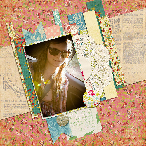
Each week I share a scrapbook layout to give you a little sneak peek into what I’m scrapping, and inspire you to play with pretty pixels too. Today I’m sharing a page about my sister.
Layout: Caitlin

How I did it
I create this page as part of Layout a Day to go with the prompt. I challenged myself to use lots of patterns as I often struggle with that.
I started with a Scrap Happy template from the monthly sketch.
- Clip the photos to the template photo spot
- Choose a background paper
- Find a doily in your stash
- Clip papers to the paper spots
- Add a journal card.
- Journal with the type tool and my handwriting font
- Add a couple of dimensional embellishments
- Add shadows
Journalling
Caitlin, you are wonderful, talented and creative. Thank you for all that you give to others.
I love you!
Note: My sister Caitlin makes AMAZING cupcakes for us 🙂 so the prompt - then there were none - reminded me of her. I found this photo that I know she likes, and tried a new style. I tilted the sketch so make the photo more upright (facebook download so it was smallish).
Credits
Celebrate by Suzy Q Scraps, Happy Little Bluebird Sugarplum by Paperie, Playful Sunshine by Quirky Twerp, You are My Happy by Kristin Cronin-Barrow, Cross Bone Cuts by I heart Princess, Scrap Happy May 2013 Sketch.
 Make it Monday
Did you see this weeks Free Layout Template from Jen Wright? I got mine! Check it out here
Care to Share?
I’d love to see what you are working on this week. Do you have a layout or two to share? You can add a picture to the comments below.
Happy Scrapping!

I am an Amazon affiliate so may receive a commission if you make a purchase.
Nice layout! I find it easier to use lots of patterns when working with a digi kit than with real paper. Love the SH sketches. Did you do your own template from the sketch, or did I miss a link to a template somewhere?? Still working on starting from scratch, but I have done one LO that way, so I know I CAN do it. Thanks in great part to encouragement from lovely ladies like you.
Libby, I’m not sure it’s still available. It was and old sketch from the blog with a PSD file included.
Wow, really pretty! I love all of the layering going on in TWO diagonals! The vintage style floral photos complement the warm tones in the photo and that pretty girl, very well!
Thanks Ashley! I’ve done only about 3 layouts on a diagonal. Caitlin is just gorgeous isn’t she?