Each week I share a scrapbook layout to give you a little sneak peek into what I’m scrapping, and inspire you to play with pretty pixels too.
Today I’m sharing a page from my family album.
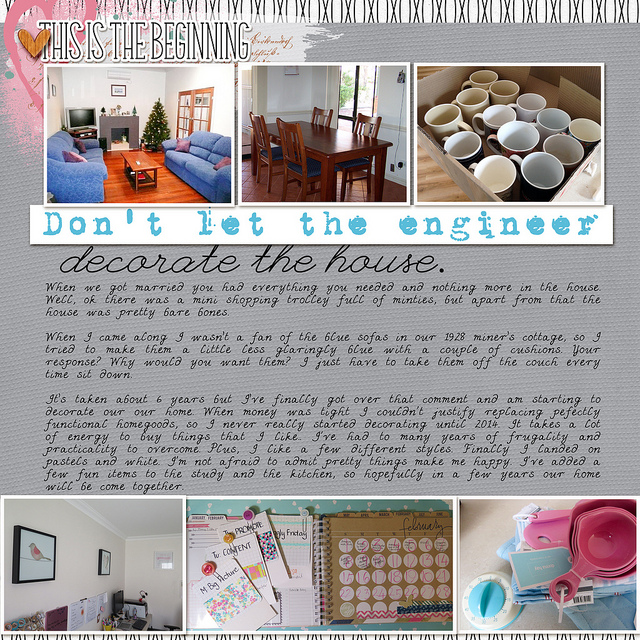
Layout: Home Decor

How I did it
I used a block design to make this layout simple.
Two bands of photos (with a white border as always!) and a big block of journaling make up the majority of the design.
I used 1942 Report and League Script to create the title. I just clipped some paper to help the title stand out.
I added some hearts (cork and paint) to add some interest and balance the pink in the lower right photo.
Journaling
When we got married you had everything you needed and nothing more in the house. Well, ok there was a mini shopping trolley full of minties, but apart from that the house was pretty bare bones. When I came along I wasn't a fan of the blue sofas in our 1928 miner's cottage, so I tried to make them a little less glaringly blue with a couple of cushions. Your response? "Why would you want them? I just have to take them off the couch every time sit down!" It's taken about 6 years but I've finally got over that comment and am starting to decorate our home. When money was tight I couldn’t justify replacing perfectly functional homegoods, so I never really started decorating until 2014. It takes a lot of energy to buy things that I like.. I’ve had too many years of frugality and practicality to overcome. Plus, I like a few different styles. Finally, I landed on pastels and white. I’m not afraid to admit pretty things make me happy. I’ve added a few fun items to the study and the kitchen, so hopefully in a few years, our home will come together.
Credits
Care to Share?
I’d love to see what you are working on this week. Do you have a layout or two to share? You can add a picture to the comments below.
Happy Scrapping!

I am an Amazon affiliate so may receive a commission if you make a purchase.
Leave a Reply